United States

US Wind Speed Map

Source: 

http://apps2.eere.energy.gov/wind/windexchange/wind_maps.asp

Image: 

A map showing the wind speeds all over America. Focusing on San Diego, it can be seen that for most of the county wind speeds are not very high.

Image Type: 

Geographic Area: 

Category: 

Year: 

Level: 

Obama administration announces $4 billion US clean energy fund

Author: 

Ed King
Loan guarantees aim to boost flagging renewables sectors, under pressure from cheaper fossil fuels
Show

The US government has made $4 billion in clean energy funding available, in support of President Obama’s Climate Action Plan.

The loan guarantees are for US renewable energy and energy efficiency projects that cut, store or reduce the country’s greenhouse gas emissions.

Geographic Area: 

Category: 

Level: 

US Groundwater Declines More Widespread Than Commonly Thought

Author: 

Lakis Polycarpou
Trends in groundwater levels observed between 1949 and 2009. Negative (red/orange) indicates decline in groundwater level, while positive (blue) indicates a rise in groundwater level. Source: Columbia Water Center
Show

Groundwater levels are dropping across a much wider swath of the United States than is generally discussed, according to a new report from the Columbia Water Center.

Geographic Area: 

Category: 

Level: 

Made in America: Staggering amounts of toxic chemicals

Author: 

Richard Denison
Although concerned about chemicals such as BPA, consumers often don't know what chemicals are present in the products they use.
Show

Recent spills in West Virginia and North Carolina cast a spotlight on toxic hazards in our midst. But as bad as they are, these acute incidents pale in scope compared to the chronic flow of hazardous chemicals coursing through our lives each day with little notice and minimal regulation.

Geographic Area: 

Category: 

Level: 

Temperatures in the Contiguous 48 United States, 1901-2013

Source: 

http://www.epa.gov/climatechange/science/indicators/weather-climate/temperature.html

Image: 

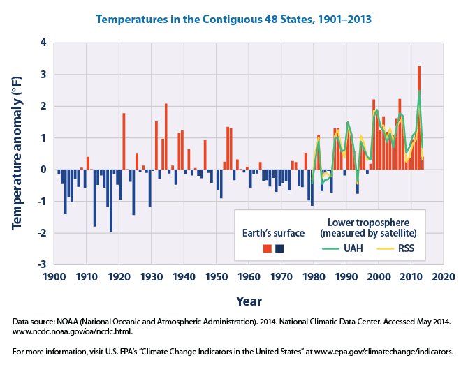
“This figure shows how annual average temperatures in the contiguous 48 states have changed since 1901. Surface data come from land-based weather stations. Satellite measurements cover the lower troposphere, which is the lowest level of the Earth’s atmosphere. “UAH” and “RSS” represent two different methods of analyzing the original satellite measurements. This graph uses the 1901–2000 average as a baseline for depicting change. Choosing a different baseline period would not change the shape of the data over time.” – United States Environmental Protection Agency

Image Type: 

Geographic Area: 

Category: 

Year: 

Level: 

Pages