Graph

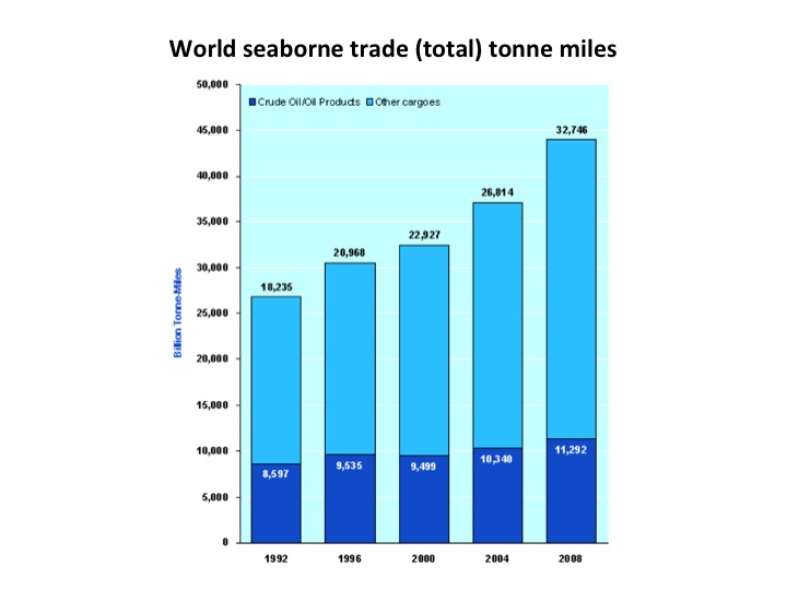
World seaborne trade (total) tonne miles

Source: 

http://www.marisec.org/shippingfacts/environmental/reduction-in-marine-pollution.php?SID=48adffcc673031547a190b20c364718b

Image: 

World seaborne trade (total) tonne miles

Between 1992 and 2008, world seaborne trade rose from 17,541 billion tonne miles to an estimated 32,746 billion tonne miles, an increase of around 85%. The carriage of oil and petroleum products accounts for a significant part of this increase, rising by about 40% from 8,043 billion tonne miles to an estimated 11,292 billion tonne miles during the same period.

Level: 

Image Type: 

Category: 

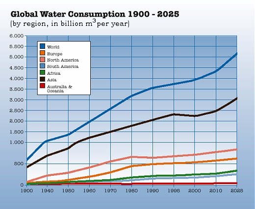
Global Water Consumption 1900-2025

Source: 

http://blogs.triplealearning.com/2011/03/diploma/dp_biology/world-water-day-3/

Image: 

Global Water Consumption 1900-2025

While the world’s population tripled in the 20th century, the use of renewable water resources has grown six-fold. Within the next fifty years, the world population will increase by another 40 to 50 %. This population growth – coupled with industrialization and urbanization – will result in an increasing demand for water and will have serious consequences on the environment.

Level: 

Image Type: 

Category: 

species extinction and human population

Source: 

http://en.wikipedia.org/wiki/Biodiversity

Image: 

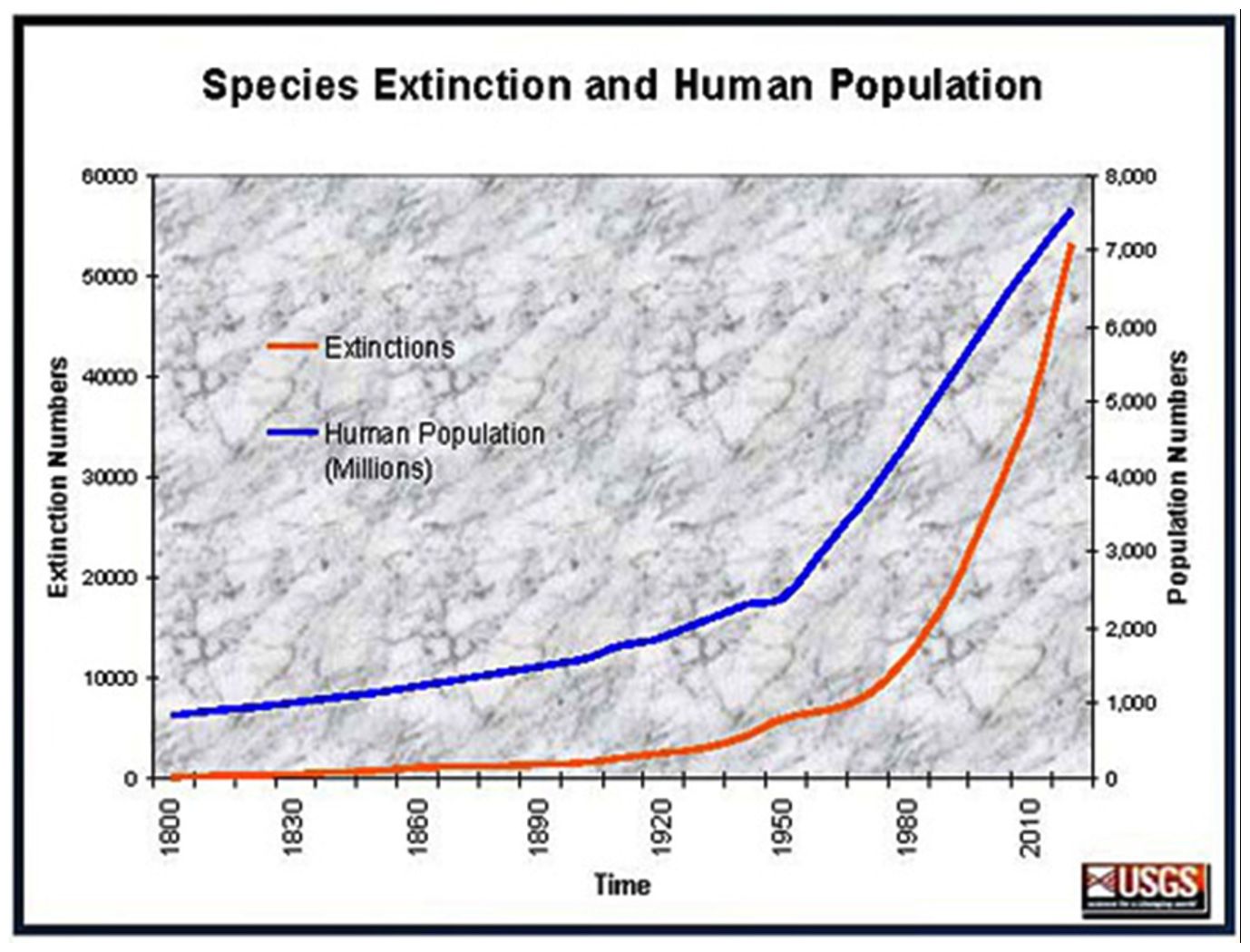
species extinction and human population

On this graph, you can see the evolution of the population according to species extinction. This evolution grown up near 1950 that is the beginning of THE industrial REVOLUTION.


LINEAR TREND BEFORE THE INDUSTRIAL REVOLUTION. EXPONENTIAL INCREASE AFTER THE INDUSTRIAL REVOLUTION.

Level: 

Image Type: 

Category: 

past and present trends on ecosystem loss

Source: 

http://en.wikipedia.org/wiki/Biodiversity

Image: 

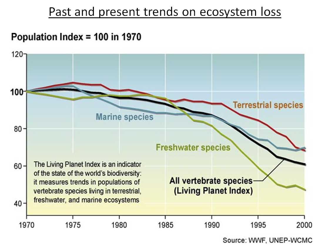
past and present trends on ecosystem loss

This picture is about past and present trends on ecosystem loss. The figure includes the marine, terrestrial , freshwater and vertebrate species. This all species decrease a lot during the 40 years.

Level: 

Image Type: 

Category: 

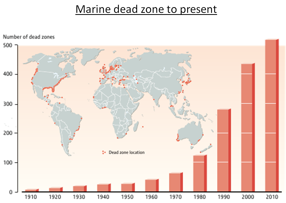
marine dead zone to present

Source: 

http://en.wikipedia.org/wiki/Biodiversity

Image: 

marine dead zone to present

THE FOLLOWING MAP SHOWS HOW MARINE DEAD ZONES ARE GLOBALLY DISTRIBUTED. MOREOVER, THE BAR CHART SHOWS THE DRAMATICALLY INCREASING NUMBER OF DEAD ZONES FROM THE BEGINNING OF THE PAST CENTURY TO THE PRESENT DAYS.

AS YOU CAN SEE, THE LARGEST AMOUNT OF DEAD ZONES IS CONCENTRATED AROUND INDUSTRIAL AND RICH COUNTRIES SUCH AS THE USA, EUROPE AND JAPAN WHERE POLLUTION LEVELS ARE VERY HIGH AND FISHING IS BROUGHT TO AN EXCESSIVE EXTENT.

Level: 

Image Type: 

Category: 

Pages